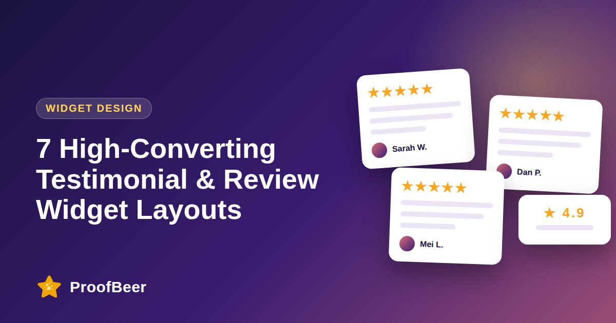
The seven highest-converting testimonial widget layouts are the masonry Wall of Love, dual-row marquee, compact avatar badge, spotlight slider, verified review badge, video testimonial card and objection-busting banner. Match each layout to the page: marquee under the homepage hero, badge next to pricing buttons, wall on a dedicated testimonial page.
- Layout decides whether visitors stop and read your reviews.
- Use a marquee for the hero, a badge for pricing and checkout, a wall for deep validation.
- Spotlight sliders suit B2B stories with metrics; video cards suit high-ticket offers.
- Pick one primary layout per page; too many widgets reduce trust.
- A/B test layout changes one variable at a time.
Why layout matters as much as the review text
- Unstyled walls of text get scanned past.
- Visual hierarchy (stars, name, photo, result) tells the eye what to read first.
- The right layout fits the visitor's mindset on that page: browse, compare or decide.
Layouts 1-3: volume and reassurance
- 1. Masonry Wall of Love: Pinterest-style columns of mixed-length reviews. Best for testimonial pages, case study hubs and high-tier landing pages.
- 2. Dual-row infinite marquee: two rows sliding in opposite directions, pause on hover. Best directly under the homepage hero.
- 3. Compact avatar badge: overlapping avatars plus 5-star rating and a line such as 'Loved by 4,500+ businesses'. Best next to pricing and checkout buttons.
Layouts 4-5: depth and verification
- 4. Featured spotlight slider: one story at a time with avatar, job title, company logo and a result metric. Best for B2B SaaS and premium coaching.
- 5. Verified review badge: shows reviews pulled from verified Google or Facebook accounts with star breakdown bars. Best for Shopify and WooCommerce product pages.
Layouts 6-7: emotion and objection handling
- 6. Interactive video testimonial card: thumbnail with play button that opens a responsive modal. Best for courses, high-ticket services and agencies.
- 7. Objection-busting banner: quotes chosen to answer hesitations such as setup time, support speed or migration. Place beside FAQ accordions on decision pages.
How to choose the right layout (decision table)
| Homepage hero - | dual-row marquee or rating badge. |
| Pricing page - | avatar badge plus 1-2 outcome quotes beside the main plan. |
| Checkout - | verified badge only, keep it small. |
| Case study page - | spotlight slider. |
| Dedicated reviews page - | masonry wall with filters. |
| FAQ and demo pages - | objection-busting banner. |
Step-by-step: how to do this with ProofBeer
List your top five pages by traffic and by revenue influence.
Write the main visitor doubt on each page.
Choose the layout from the table above that answers that doubt.
Embed the widget with the ProofBeer snippet and match brand colours and fonts.
Check mobile layout, touch targets and load speed.
Run an A/B test for two weeks and keep the winner.
Common mistakes to avoid
Metrics to track
Widget impression-to-click rate.
Conversion rate on the page with and without the widget.
Scroll depth and time on page.
Cumulative layout shift (CLS) after adding the widget.
Quick checklist
Examples and templates
dual-row marquee with 12 short quotes
avatar badge + one outcome quote beside the 'Pro' plan
spotlight slider with a '+42% revenue in 30 days' metric
objection-busting banner next to 'How hard is setup?'
- Use quotes under 25 words in marquees
- Pause animation on hover and on 'prefers-reduced-motion'
- Put the strongest quote first; people read the first card most
How ProofBeer Helps You Grow
Seven widget styles in one dashboard, with brand colour and font controls.
One embed snippet that works on any CMS or site builder.
Widget analytics help you see which layout gets clicks.
Frequently Asked Questions
What is the best testimonial widget layout?
It depends on the page. A marquee works best under a homepage hero, a badge next to pricing buttons, and a masonry wall on a dedicated testimonial page.
How many testimonials should I show in a widget?
Show 6-12 relevant reviews in a wall or carousel, and 1-3 on pricing or checkout pages. Quality and relevance matter more than volume.
Do testimonial widgets hurt page speed?
Heavy ones can. Use lightweight, async or deferred embeds and measure Core Web Vitals before and after.
Should widgets show only 5-star reviews?
Show mostly 4-5 star reviews, but a few honest 3-4 star reviews increase believability. Never hide all negative feedback.
Can I use video testimonials in widgets?
Yes. A video card with a thumbnail and transcript snippet works well on pricing and sales pages for high-ticket offers.
Conclusion
Layout is a conversion lever. Choose the format that matches the visitor's doubt on each page, keep it fast and mobile-friendly, and test one change at a time.
- Baymard Institute research on product-page trust signals (cite specific article)
- ProofBeer widget analytics example (your own data)